
I’ve been working on this illustration for a friend. Really growing fond of it — can’t wait to finish!
I’ve been working on this illustration for a friend. Really growing fond of it — can’t wait to finish!

I’ve been enjoying my new job a lot — but also doing my best to set aside time for personal projects. This one in particular is a… semi-personal project, I suppose. I developed a logotype for the game store my husband is planning to open. We’ve had a name in mind for a while, and figured it was time to start thinking of a visual identity.
To go with the gaming theme, I picked the shape of a 20-sided die, which is used for certain games (notably, Dungeons & Dragons). It’s definitely a symbol that would be recognized by avid gamers. However, I wanted to avoid it looking too cheesy and ‘nerdy’, so I simplified it down to clean geometric lines.
I think it looks pretty good. There’s plenty of time to tweak it yet, but for now I’m happy with this direction.

I’m taking a class at Skillshare right now — an open skills teaching environment. The one I’m doing happens to be free, but most classes are just 20 bucks or so. Lots of design stuff, but also cooking, business and other sorts of classes as well.
Anyway, my class is called ‘Illustrate Your Day: An Intro to Symbol Design’ and the project we’re working on is a set of symbols that tells the story of your daily routine.
I was doing some concept sketches last night and… symbol design is pretty tricky! I’ll keep you updated as I progress.
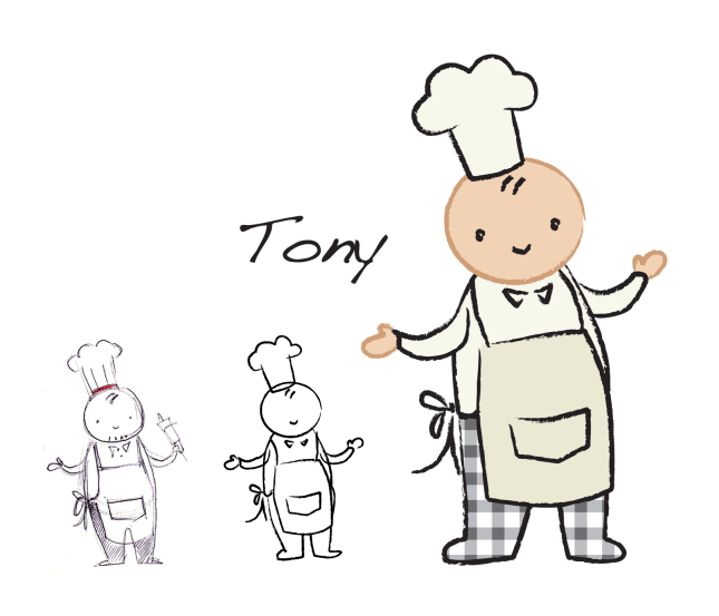
When I went to school at Humber, we shared a building with a few culinary classrooms. The chefs-in-training had checkered pants as part of their uniform, so I guess there’s some reason for that?
Anyway, here’s teeny Chef Tony. He’s got his regulation checkered pants and everything!
I’ll be using him in a demo training course I’m making to show my abilities with e-learning authoring tools like Adobe Captivate and Articulate Storyline. More screenshots from that as I progress along.
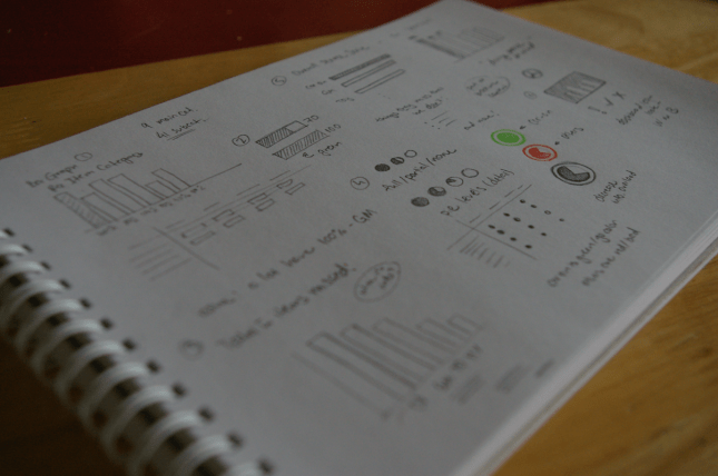
I’m working on a quick project for a car dealership in Ottawa. They’re looking for a big checklist — and by big, I mean really big. Like, over 250 items big.
That’s pretty unmanageable when you’re talking standard print materials, so I’m sketching up some ideas about presenting it in some sort of clever infographic format instead.
I think I’m a fan of miniature pie charts. You can tell because I doodled them in colour, and, well, they’re pie charts. Everybody loves pie charts.

Hey all! I’m currently working on the layout and design of my new portfolio. It’s sort of hard to get a feel for that sort of thing on a computer screen alone, so here it is as a sort of print ‘mock-up’ — printed out on my aging printer and filed in page protectors. This way I can flip through and get a sense of how it will really look and feel once it’s complete.
The good part about the page protectors is that if you make a revision, you can just print out the new page and replace it right away.
I’m going to need to make a few of those revisions, and then it’s good to go. Should have it done early this coming week!
Also, a glass of wildflowers. Nothing like some dandy lions to cheer things up.
